


As a geek born in the early 1990s, who has been playing with computers from a young age, I think fondly of what tech looked like in the late 1990s and early 2000s.
So, naturally, when I got my hands on an old computer a few months ago, I installed Windows 98 on it as a way to revive software from my childhood and play around with it. Among the gems I wanted to revisit was Netscape Communicator, a software suite from 1997 centered around Netscape Navigator, which was the first web browser I ever used. One of the other applications included in that suite was a WYSIWYG web page editor named Netscape Composer.
Netscape Composer was my first introduction to web development. As a kid, I created my first web pages using it. Those pages never made it online, but I proudly carried them around on a floppy disk to show them off on family members' and friends' computers. This is likely how I got the understanding that websites are just made of files. Using Netscape Composer also taught me basic web vocabulary, such as "page" and "hyperlink".
Of course, the web landscape has evolved immensely since then. I was curious to try out that dated software again and see what its limitations were, and what the code it produces looks like from a 2024 perspective. The first thing I needed was a goal. I decided to try and reproduce the home page of my personal website as closely as the application allowed it. That seemed like a sensible aim as my website has a rather minimalistic design, with very little that should be completely out of reach for an antiquated tool.
The version of Netscape Composer I used is the one included in Netscape Communicator 4.8, released in 2002. I set the following rules for my experiment:
- The aim was to create a web page looking as much as possible like my actual website's home page;
- By using Netscape Composer only;
- Without writing a single line of HTML or CSS;
- I was allowed to use images for the social media icons in the page footer.
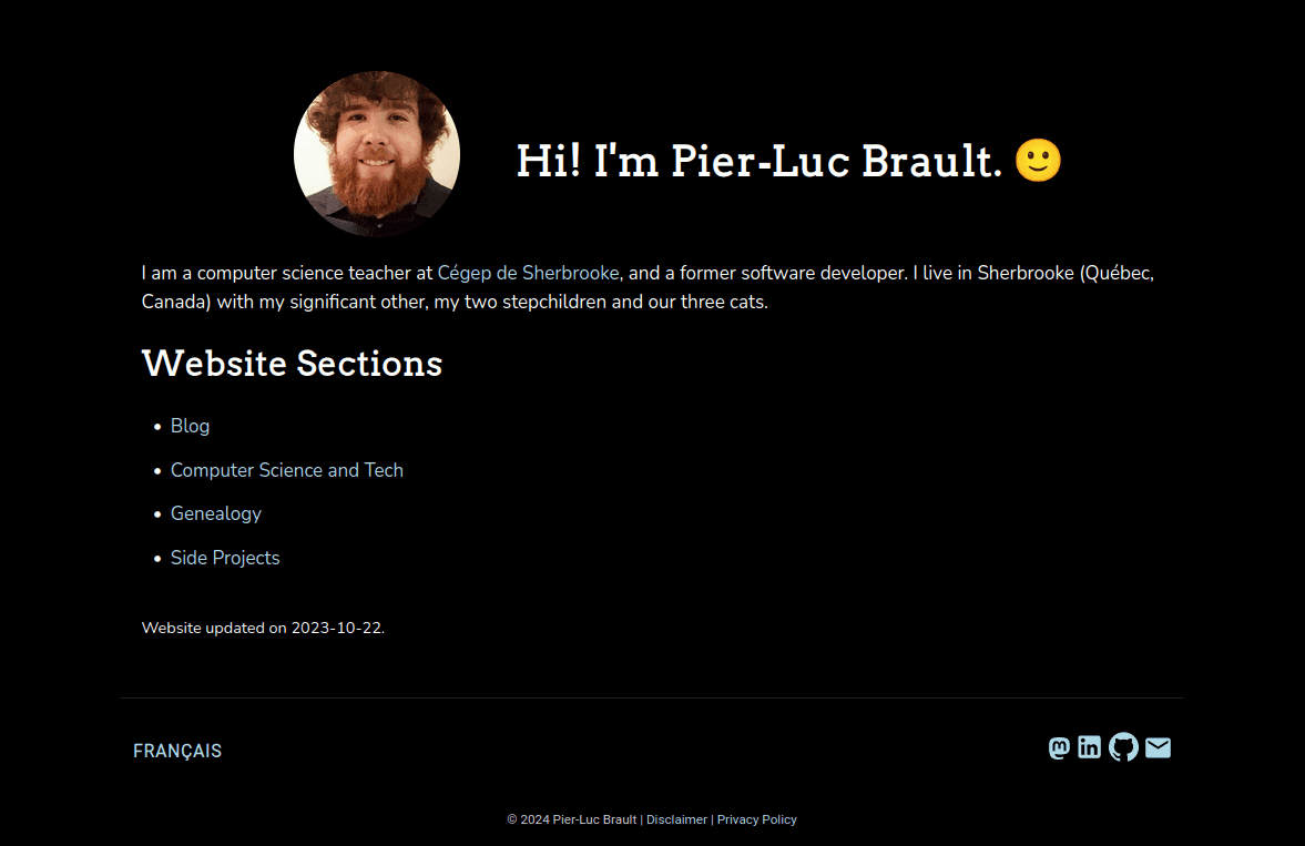
The Aim
This is what my actual home page looks like:
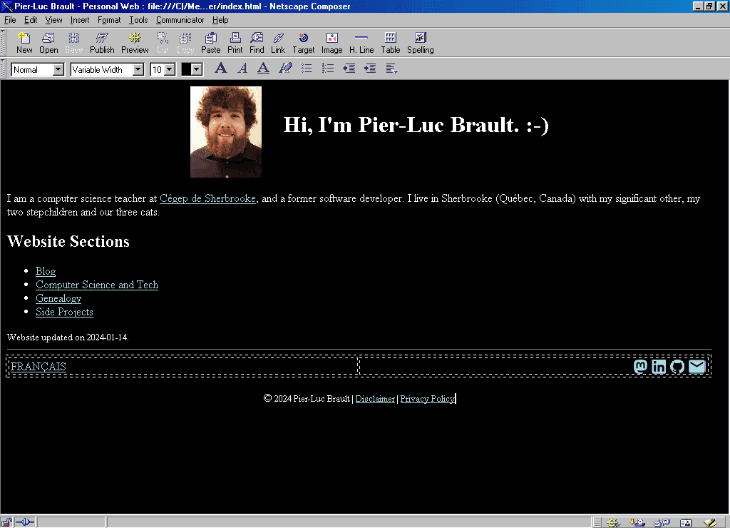
The Visual Result
This is the end result, as seen in Netscape Composer itself:
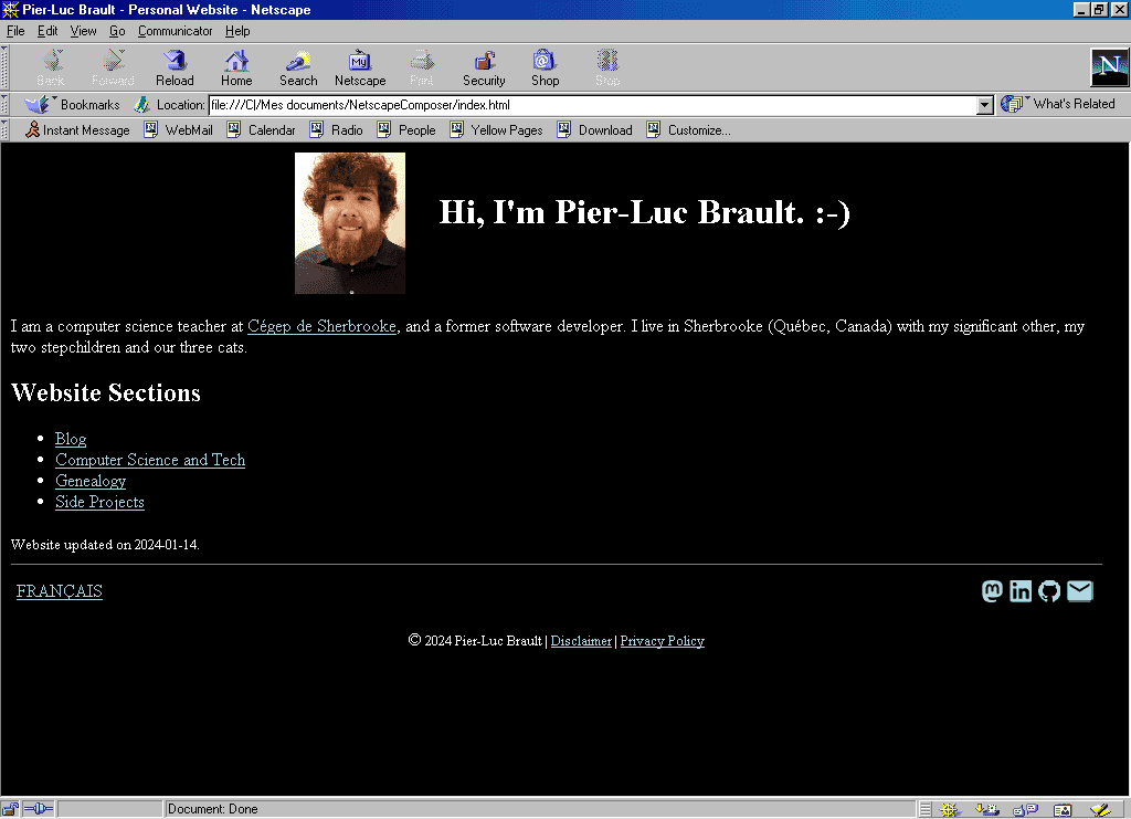
And now, the same result, as seen in Netscape Navigator with a 1024x768 resolution:
Finally, what it looks like on a modern browser:
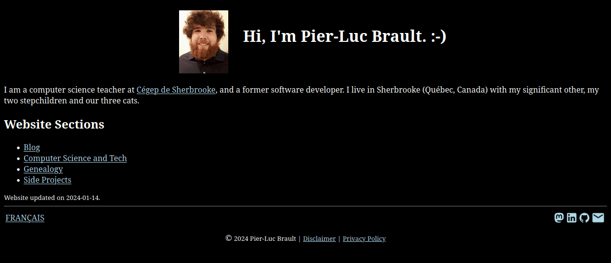
Here are some ways in which the look of the result differs from the aim:
- The result pretty much occupies the whole viewport, with no margin. I did not find a way to add margins or padding to the page's body in Netscape Composer.
- My picture is not circle-shaped.
- I had to settle for
:-)in lieu of the smiling emoji. As Netscape Composer has an "Insert Special Character" feature, I was hoping it would at least offer me a ☺, but it did not. I could of course have copied that symbol from somewhere, but I felt like that would have moved me away from my goal of using only Netscape Composer. - The links in the result are underlined. I was not able to change their styling other than the color.
- The margins between elements are wrong. I was not able to customize them except for the images.
- The result uses default fonts available in web browsers. I did not find a way to add custom fonts.
The Resulting HTML
This is the HTML that was produced by Netscape Composer:
<!doctype html public "-//w3c//dtd html 4.0 transitional//en">
<html>
<head>
<meta http-equiv="Content-Type" content="text/html; charset=iso-8859-1">
<meta name="Author" content="Pier-Luc Brault">
<meta name="GENERATOR" content="Mozilla/4.8 [en] (Win98; U) [Netscape]">
<meta name="description" content="Partying like it's 1998!">
<title>Pier-Luc Brault - Personal Website</title>
</head>
<body text="#FFFFFF" bgcolor="#000000" link="#ADD8E6" vlink="#ADD8E6" alink="#ADD8E6">
<center>
<h1>
<img SRC="photo.jpg" HSPACE=30 height=128 width=100 align=CENTER>Hi, I'm
Pier-Luc Brault. :-)</h1></center>
I am a computer science teacher at <a href="https://en.wikipedia.org/wiki/Cegep_de_Sherbrooke">Cégep
de Sherbrooke</a>, and a former software developer. I live in Sherbrooke
(Québec, Canada) with my significant other, my two stepchildren
and our three cats.
<h2>
Website Sections</h2>
<ul>
<li>
<a href="https://plbrault.com/blog-en/">Blog</a></li>
<li>
<a href="https://plbrault.com/computer-science-tech-en/">Computer Science
and Tech</a></li>
<li>
<a href="https://plbrault.com/genealogy-en/">Genealogy</a></li>
<li>
<a href="https://plbrault.com/side-projects-en/">Side Projects</a></li>
</ul>
<font size=-1>Website updated on 2024-01-14.</font>
<br>
<hr SIZE=1 WIDTH="100%">
<table COLS=2 WIDTH="100%" >
<tr>
<td><font color="#FFFFFF"><a href="https://plbrault.com/fr">FRANÇAIS</a></font></td>
<td>
<div align=right><a href="https://fosstodon.org/@plbrault"><img SRC="mastodon.gif" HSPACE=3 BORDER=0 height=20 width=19 align=TEXTTOP></a><a href="https://linkedin.com/in/plbrault"><img SRC="linkedin.gif" HSPACE=3 BORDER=0 height=20 width=20 align=TEXTTOP></a><a href="https://github.com/plbrault"><img SRC="github.gif" HSPACE=3 BORDER=0 height=20 width=20 align=TEXTTOP></a><a href="mailto:pier-luc@brault.me"><img SRC="email.gif" HSPACE=3 BORDER=0 height=20 width=24 align=TEXTTOP></a></div>
</td>
</tr>
</table>
<center>
<p>© <font size=-1>2024 Pier-Luc Brault | <a href="https://plbrault.com/disclaimer-en">Disclaimer</a>
| <a href="https://plbrault.com/privacy-policy-en">Privacy Policy</a></font></center>
</body>
</html>So, how does it look?
I'm gonna go ahead and say: not so bad, actually! Sure, it lacks a bit of indentation, and it contains a few things that would make any modern web developer cringe, such as font and center tags, and styling attributes (Netscape Composer did not know CSS). But it is not worse than some of the old-fashioned HTML I have seen from university professors. Hey, at least the tags are not written in all caps!
On a more technical point of view now: did I get valid HTML? Let's throw that code at the W3C Validator!
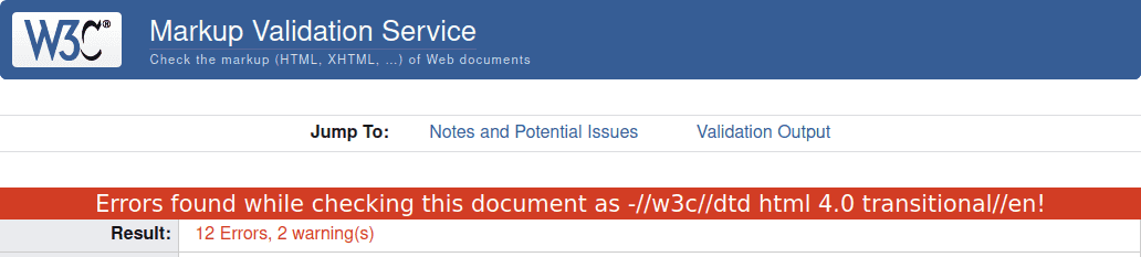
Oops, it turns out the code contains quite a few errors according to the W3C, mostly about using invalid attributes and values, as well as missing alternative texts for images (the latter could have been fixed directly in Netscape Composer). Nevertheless, it would have rendered as intended in 2002, and it is rendering as intended today. What I saw in Netscape Composer was what I got!
The Journey
So, how was it to use a WYSIWYG web page editor from over 20 years ago? Quite pleasant, actually. That application has more than decent UX, and has not made me swear nearly as much as Microsoft Word does in a typical usage session. Here is an overview of the steps I followed to create my page:
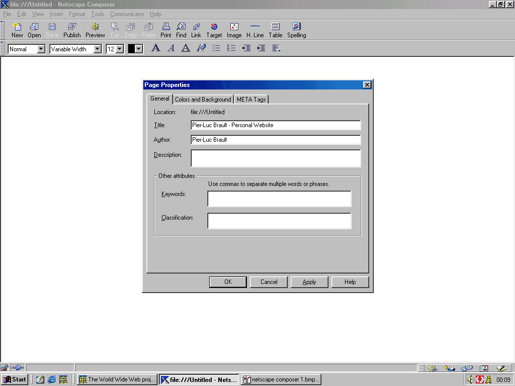
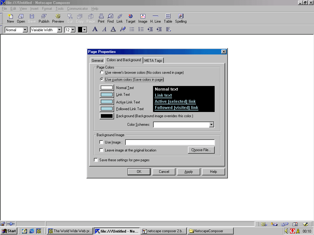
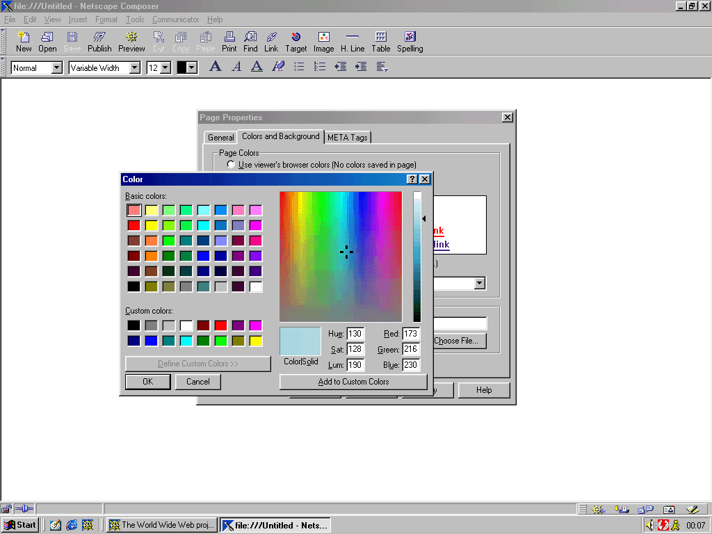
I started with setting some general properties for the page, such as its title, background color, and text colors for paragraphs and links.
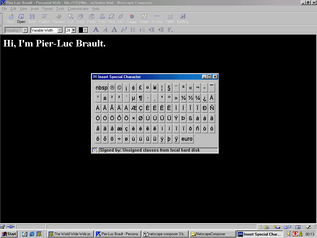
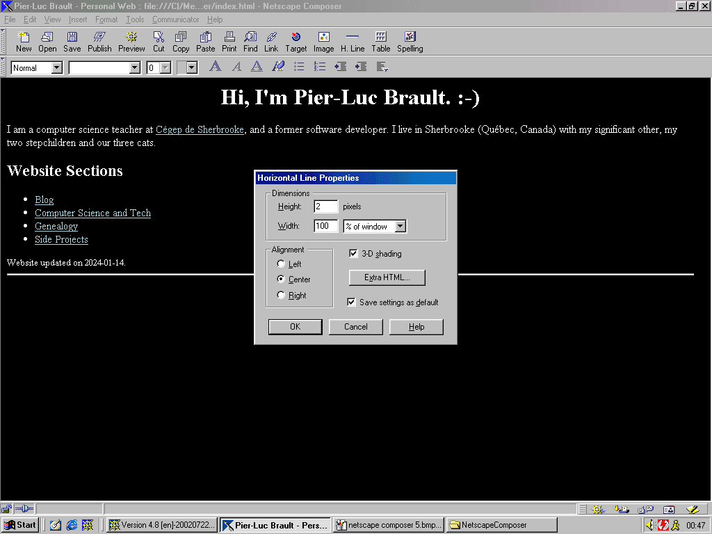
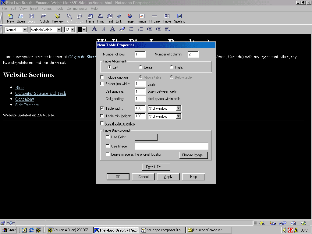
Then I proceeded to type the text content of my page, discovering the "Insert Special Character" feature along the way (that I hoped would contain ☺). Dropdown menus on the top toolbar made it easy to style all the text as needed. It was also quite easy to add the horizontal line and the table, and to customize them as needed.
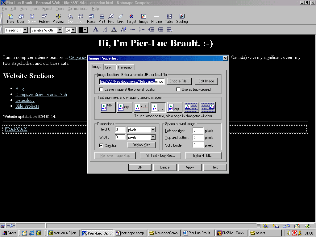
The following step was to add the image at the top of the page and make sure it floated as intended on the left of the title. That went surprisingly well! It is one of the ways in which Netscape Composer failed to make me swear as much as Microsoft Word.
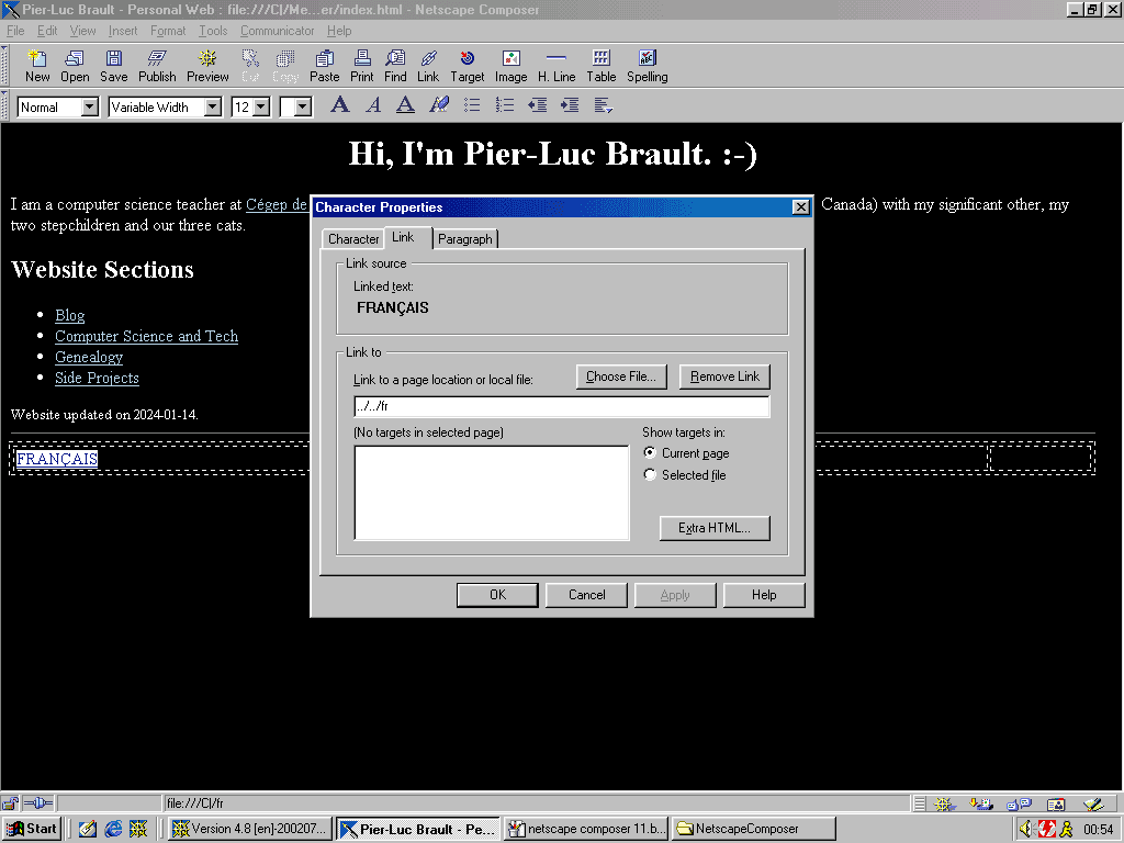
At some point along the way, I realized that Netscape Composer did not like the relative addresses I had used for my links (maybe because the targetted files did not actually exist on my file system?), and had weirdly added ../../ at the beginning of all of them. I therefore changed them to absolute URLs.
Fun fact: to transfer the images I needed for my web page to my Windows 98 machine, I used an unsecured FTP server on Debian, hosted on my local network, that I accessed using an old version of FileZilla. It just worked! I used the same method to transfer all the screenshots I took for this blog post back to my contemporary computer.
The Bottomline
I think the main thing I will remember about this experiment is: I had fun! It was a pleasant stroll down memory lane and a nice reminder of what HTML used to look like. It also made the demonstration that the Web was built as such a robust platform that outdated HTML generated by an app from more than two decades ago can still render as originally intended on a modern web browser. I will also remember that good UX can be found in old-timey applications too!